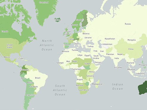
Two years ago, we shared our goal of fighting climate change by reducing our operational emissions by 75% over 2017 levels, which we expect to achieve this year. We’ve developed innovative new methods and designs for hyperefficient data centers to curb our carbon emissions and fight climate change. Now, furthering our support for the movement to leverage technology to drive climate action, we are partnering with global organizations like the World Resources Institute and Yale University to launch the Climate Conversation Map. These maps marry data science research, computing power and aggregated, anonymized platform data to summarize and map the prevalence of these conversations and provide insight into where, when and how often people share or react to links related to climate change on Facebook.
The Climate Conversation Map is now available to partners and provides new information to help others advance climate action, including important data and insights into how conversations on the topic ebb and flow throughout the world and over time. These maps provide organizations with a way to visualize the rate of engagement with climate-related news in various regions. Developing this new product is part of our commitment to sustainability, the United Nations’ Sustainable Development Goals (SDG 13), and the We Are Still In coalition.
How Climate Conversation Map Works
To create the maps, an automated system pulls the daily volume of total external link shares on Facebook, as well as the number of reshares and comments/reactions to the links. The system then flags the subset of links containing the keywords “climate change” or “global warming” across 21 major languages (determined by population size and number of active Facebook users).
Each week, the resulting information is anonymized and aggregated. In areas where the number of people sharing these types of links is greater than 10, the system computes the absolute number of links related to climate change and the relative percentage of total links shared. The result is a series of color-coded world maps that update weekly. Dark green areas indicate climate change conversation hotspots, whereas lighter green indicates less active areas.
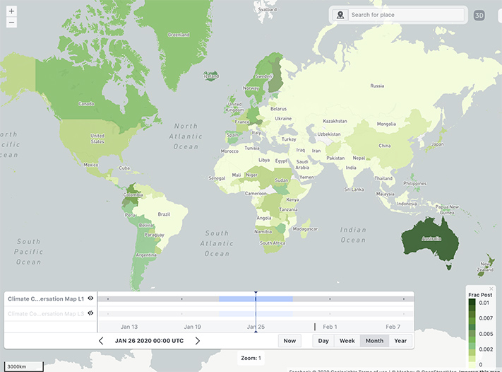
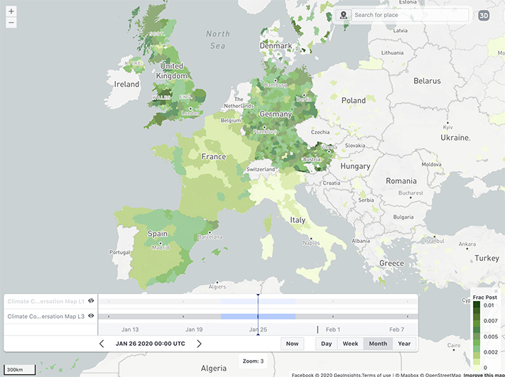
Sharing Climate Conversation Map
Last September, we previewed a prototype of Climate Conversation Map for several major organizations during the UN General Assembly and Climate Week in New York City. Since that time, we’ve seen how climate conversations shift during times of natural disaster. For example, when fires in Australia flared up in January, the average percentage of shared climate change content in the country increased from 1.4% to 2.4% in less than a month.
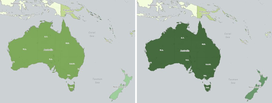
From August 2019 through February 2020, Australia was the country with the highest percentage of climate-change-related links, followed by New Zealand, as seen in the graph below. The next group of countries were those in Europe and the Americas, with high-latitude countries such as Norway and Canada at the top of the list.
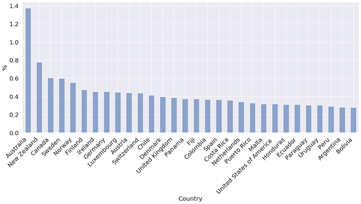
More recently, we shared the Climate Conversation Map with more than 100 Data for Good partner organizations. Feedback has been positive and has indicated that these maps fill a gap in the available data on the topic of climate. “Relative to traditional survey methods, the climate conversation data also feels a lot more representative of actual population-level conversations,” say our partners at the University of Otago, New Zealand. “In short, to the best of our knowledge, the data set is the largest and richest source of information on climate conversation engagement available. … Subsequent benefits of the data include accurate predictions of (a) climate conversation shifts and (b) if these shifts are keeping pace with society’s need to change. NGOs and policymakers can then use this information to tailor messaging and better manage our inevitable transition.”
Responding to Feedback
One of the things we’ve already heard from partners is that they want the ability to identify top stories driving the conversation, so we worked with CrowdTangle to build a Climate Conversation Live Display. This public Live Display searches for “climate change” and “global warming” in the same 21 languages used in the Climate Conversation Map.
We are excited to share these tools with leading researchers and nonprofits in the climate space. We look forward to seeing how different organizations use these maps to inform the climate debate and deliver new resources. Those interested in accessing the Climate Conversation Map for nonprofit or research use should email us at climateconvomaps@fb.com.
We’d like to thank Mercedes Erdey and all those who contributed to the Climate Conversation Map and Live Display.
The post Climate Conversation Map Provides Insight to Help Global Organizations appeared first on About Facebook.
source https://about.fb.com/news/2020/04/climate-conversation-map/


0 Comments